Design & Art Direction
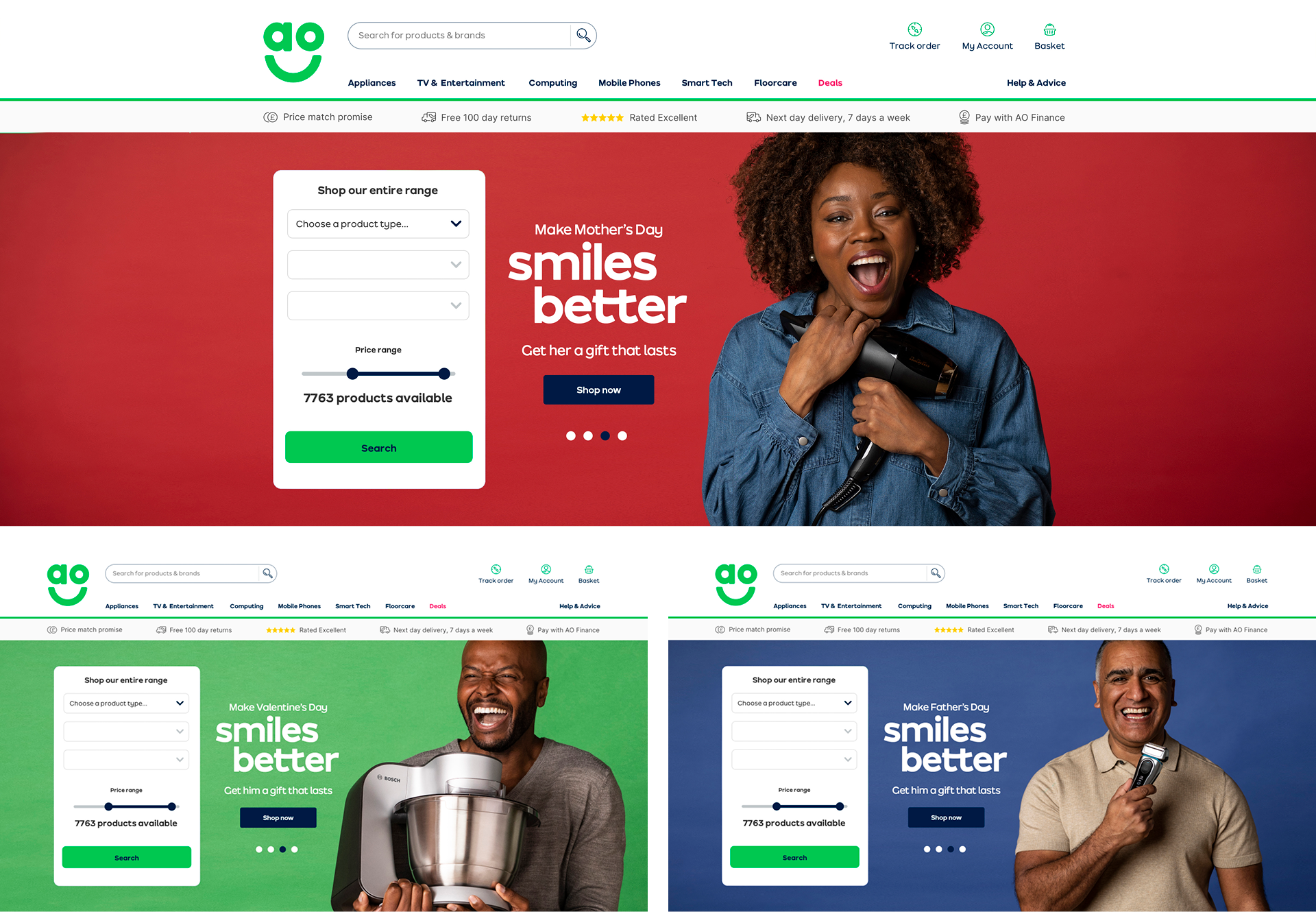
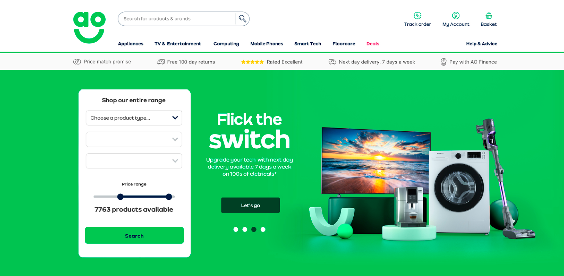
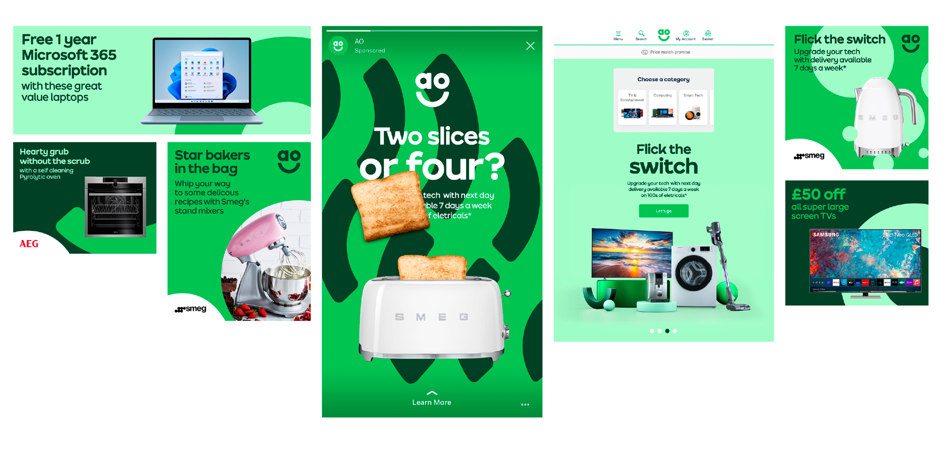
AO | Smiles Better
The Context
AO is a leading online electricals retailer, and this was a strategic initiative designed to encourage customers to choose long-lasting, meaningful gifts for major retail calendar events.
The Challenge
AO’s traditional focus was on electricals as functional products. The challenge was to shift the internal culture and the customer's perception away from the machine itself and toward the human emotion it facilitates. As Head of Design at AO, I frequently advocated for this shift internally with the mantra: "We don’t sell white goods; we sell emotions."
The Solution
We moved people to the front and centre of the brand. For the first time for AO, human-centric photography was featured in the website’s primary header. We paired this with the "Smiles Better" headline – a brand-ownable phrase that was both highly campaignable and emotionally resonant.
Photography by Matt Wright.
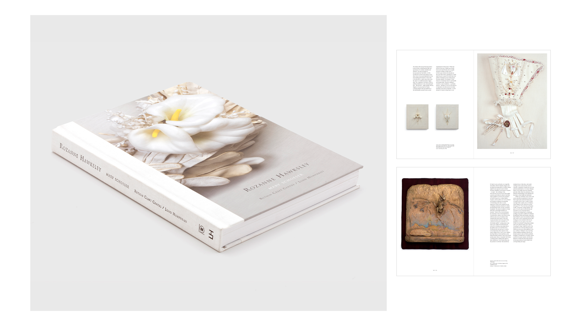
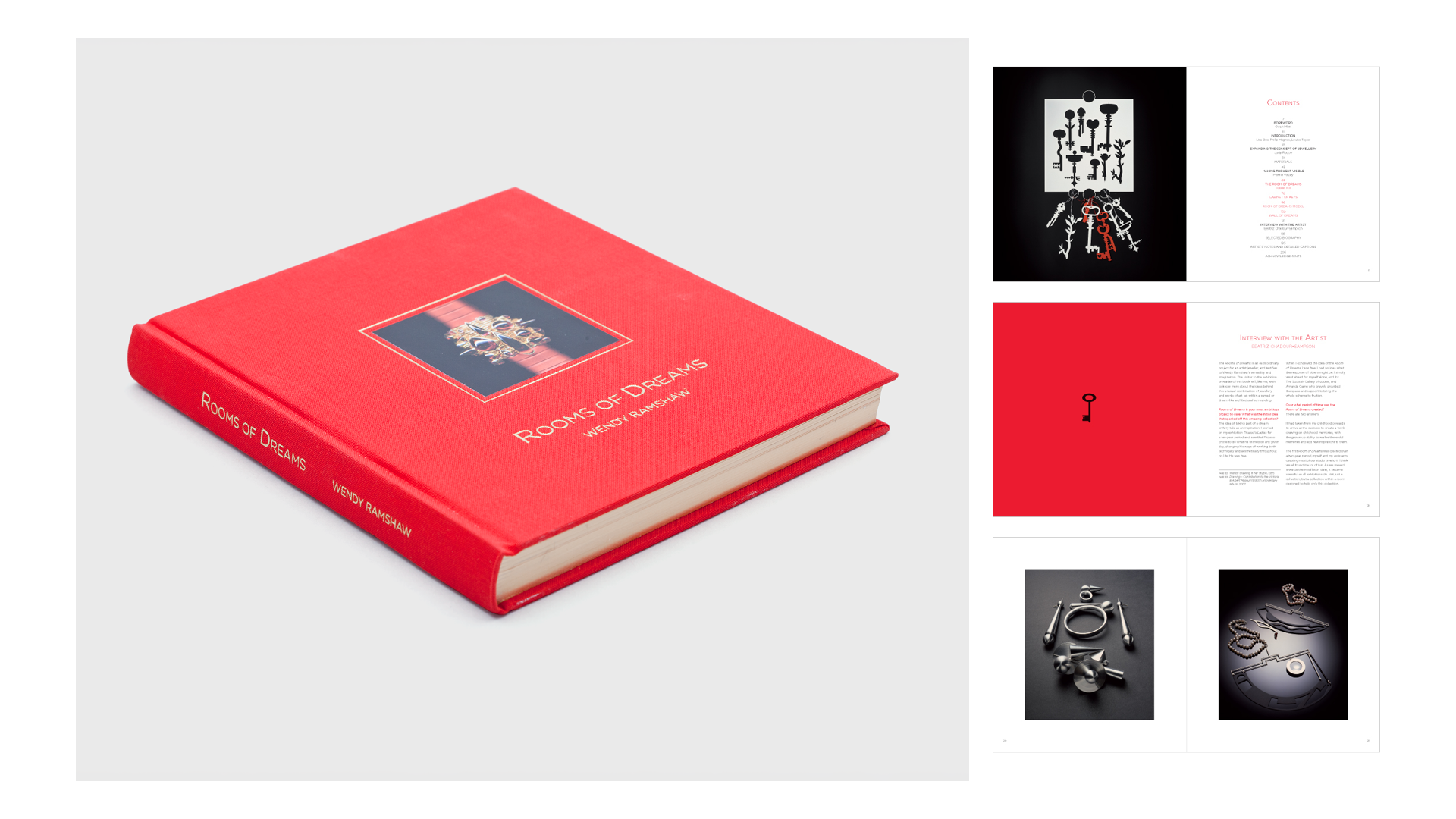
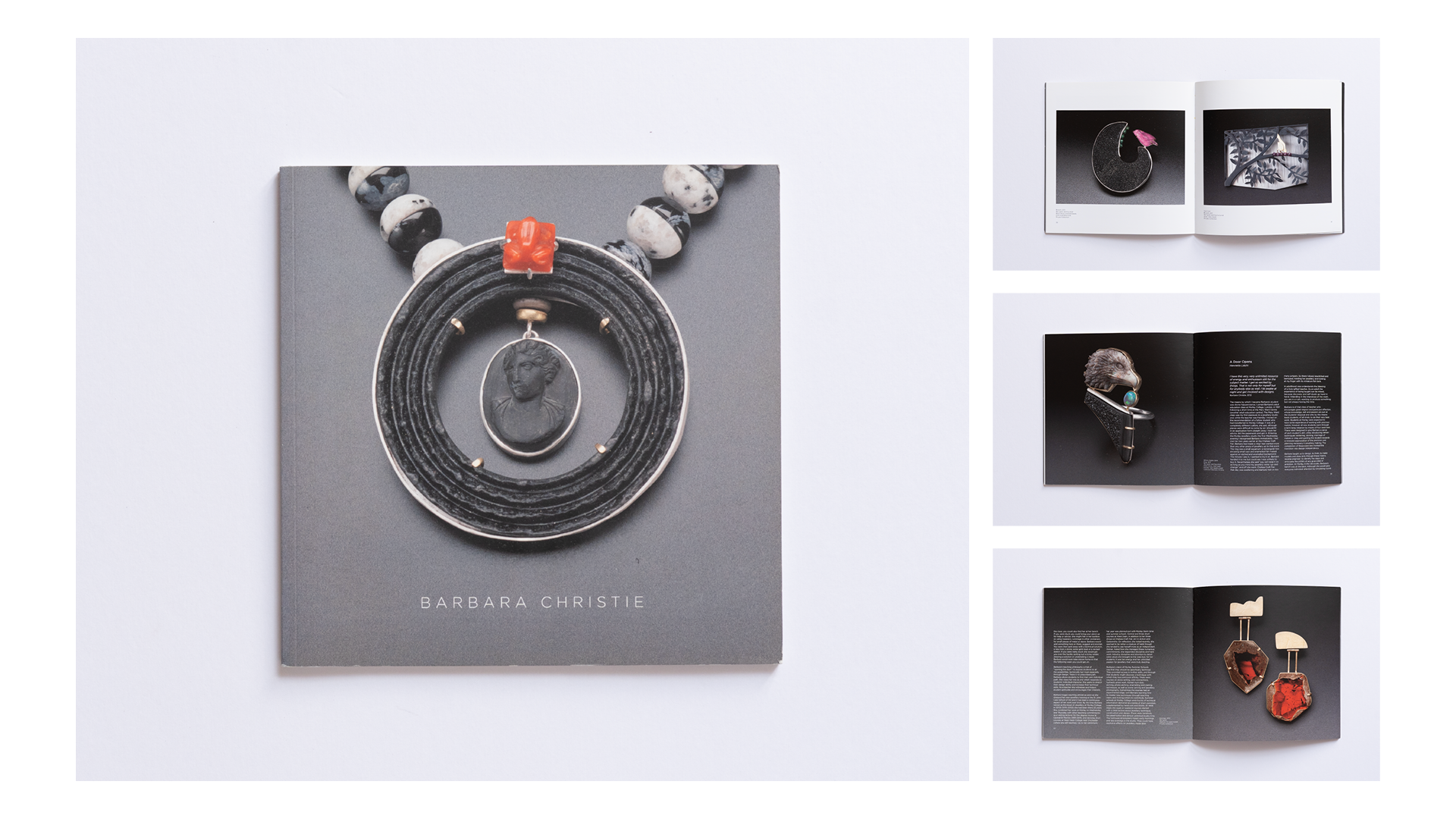
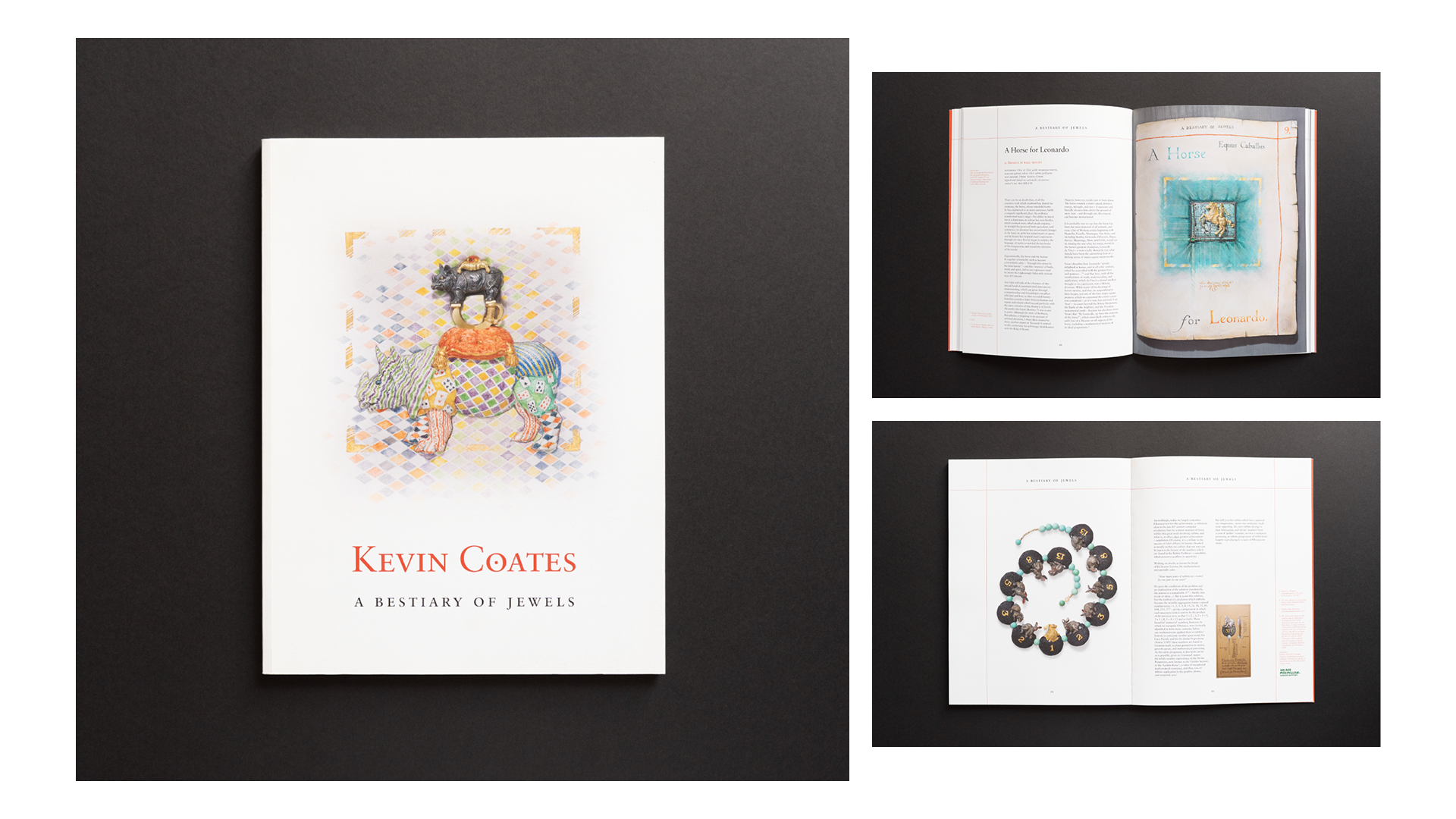
Contemporary Applied Arts | Publishing
The Context
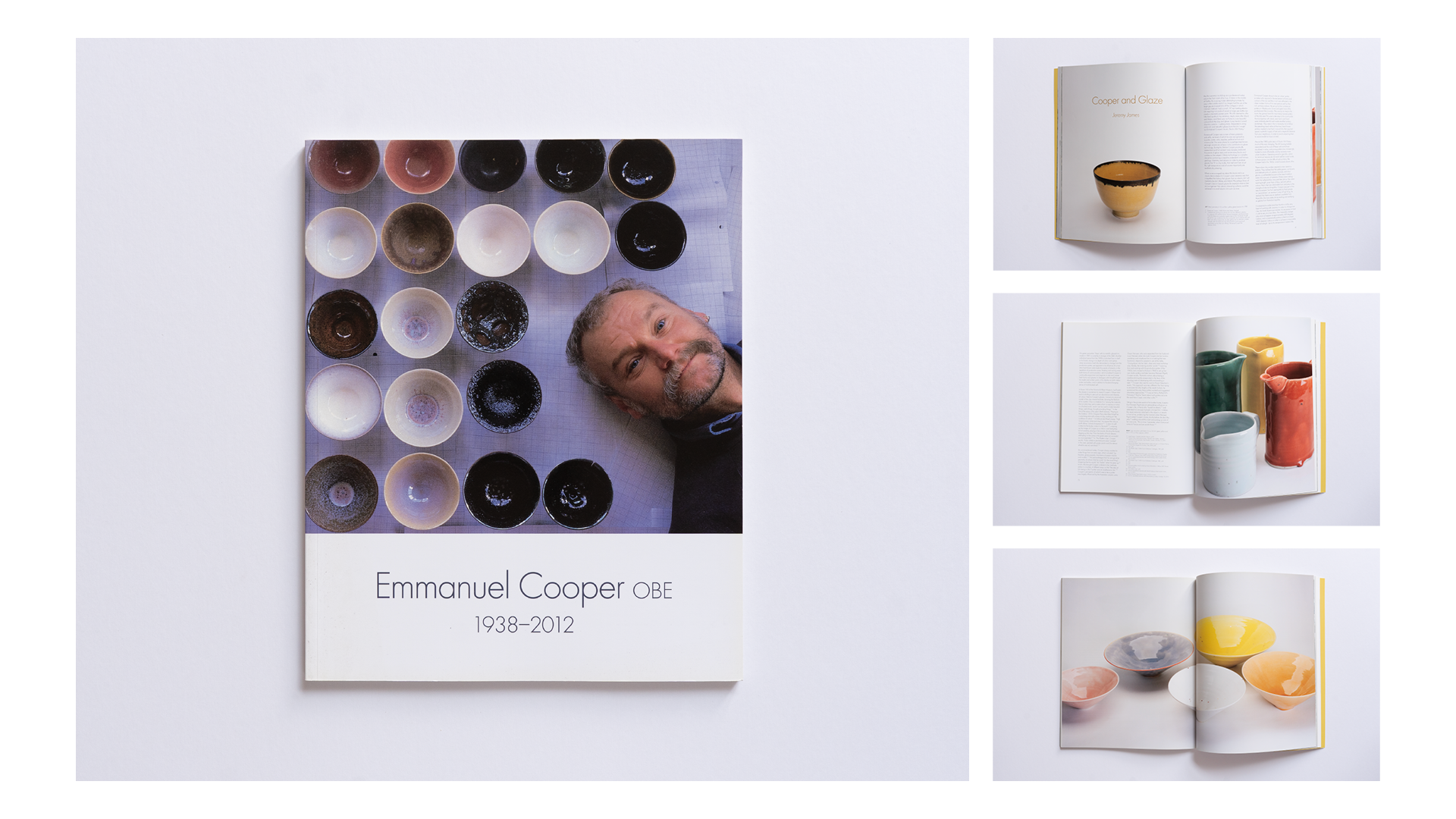
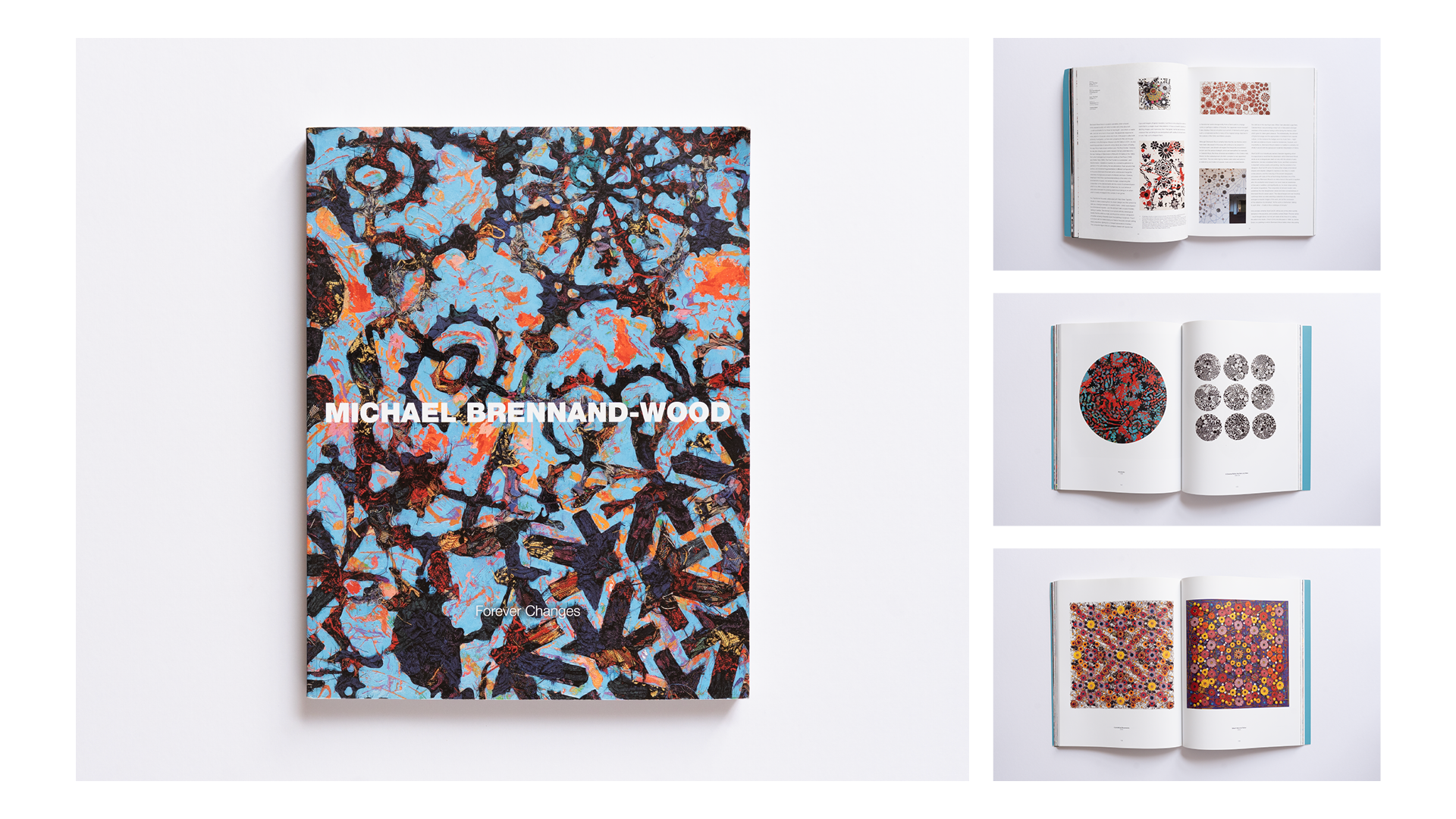
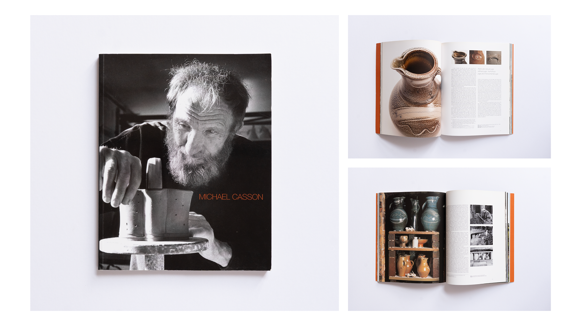
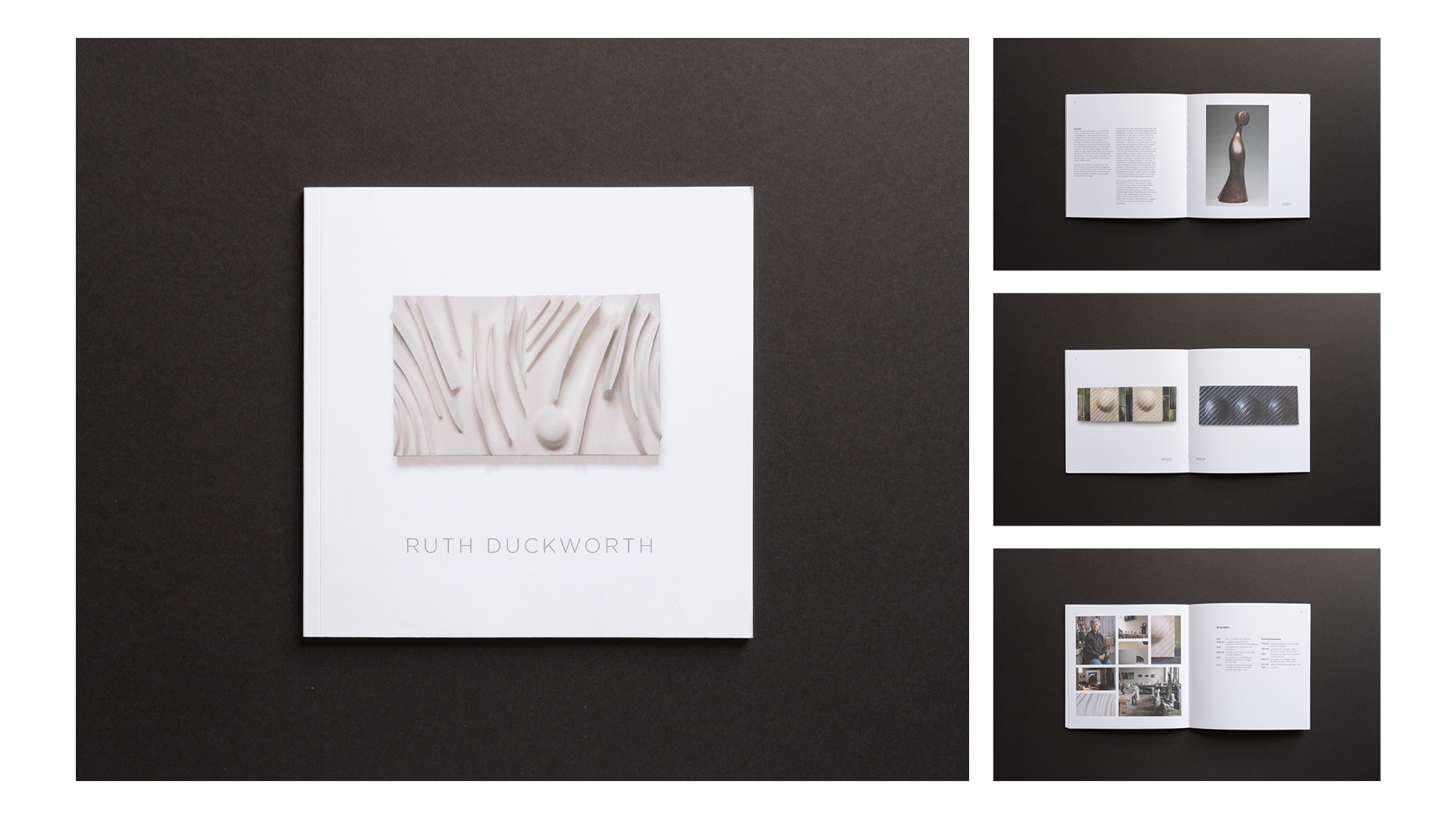
Working within the contemporary applied arts sector – collaborating with publishers, galleries, craft centres, and individual makers – demands a distinct design sensitivity. The focus shifts away from hard-selling and toward cultural longevity.
The Challenge
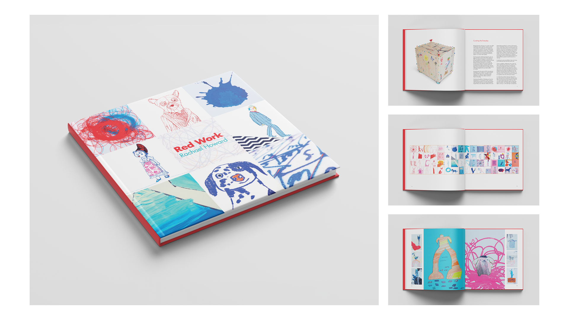
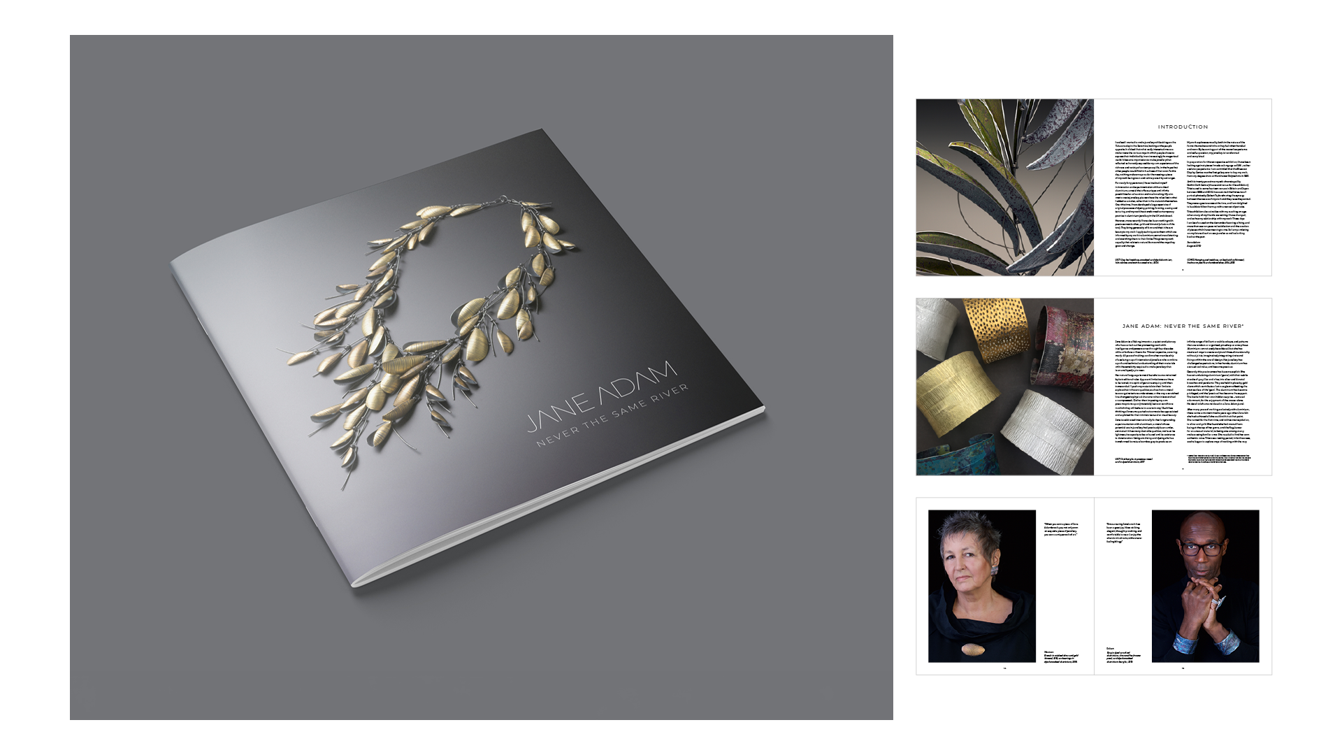
The design must remain quiet so the maker's craftsmanship takes centre stage. Because monographs and exhibition publications are made to be treasured, uncompromising image clarity and print production are essential.
The Solution
A refined, restrained design framework where typography, layout, and whitespace defer to the art. By pairing high-quality photography with meticulous print finishes, we create enduring physical objects that honour the maker's craft and elevate the publication.
Selected work for Ruthin Craft Centre produced while at Lawn Creative.

Socialproof | Social Media Marketing
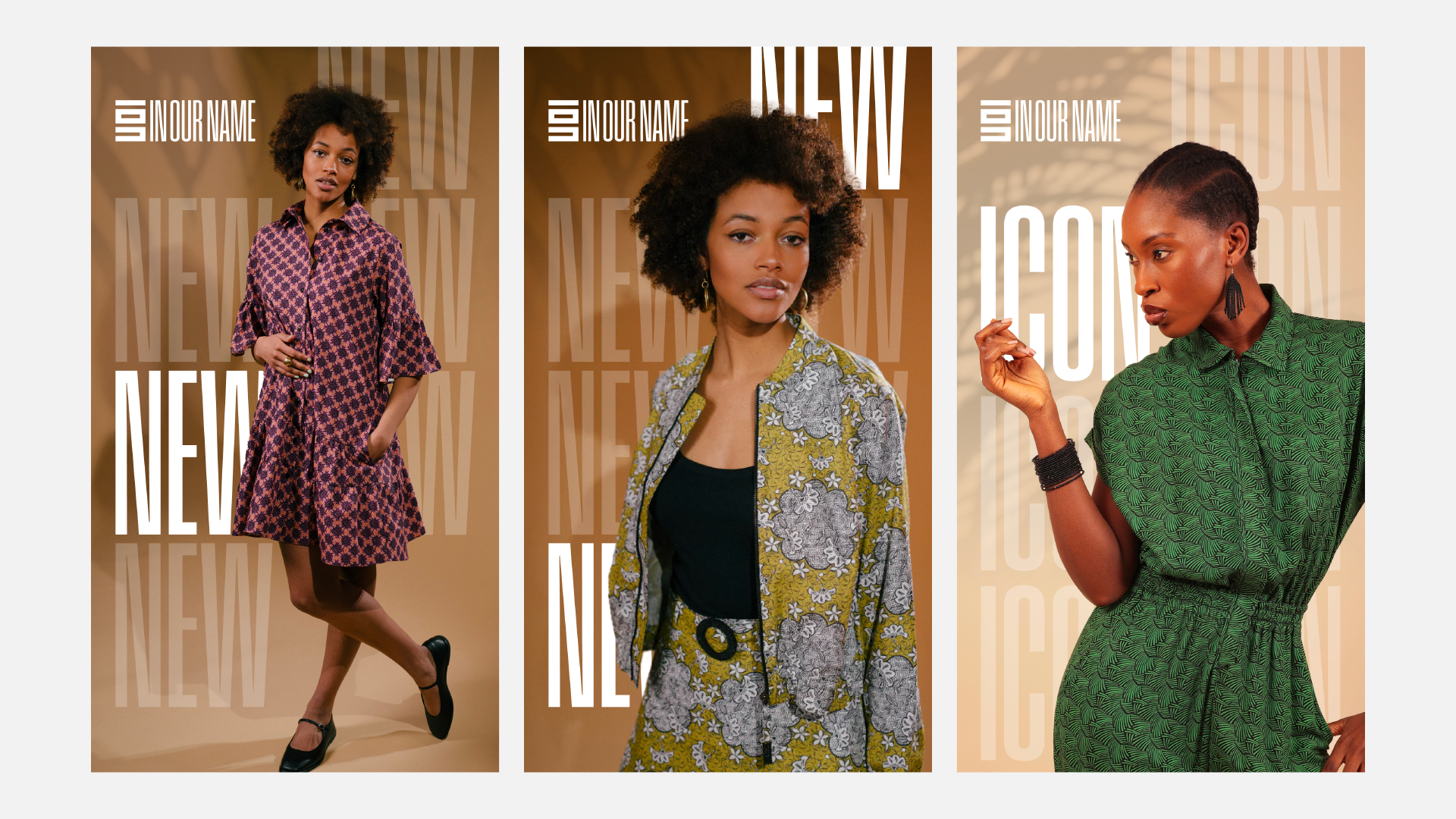
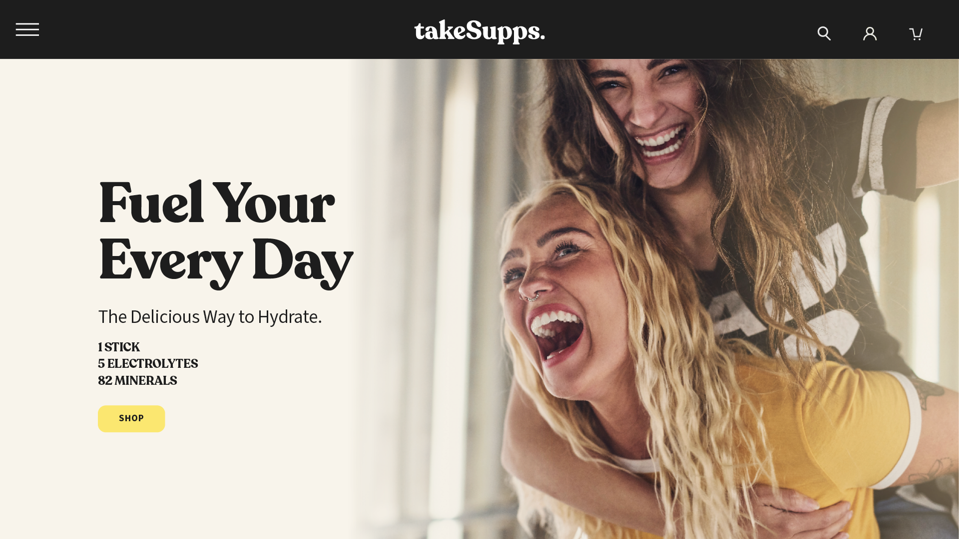
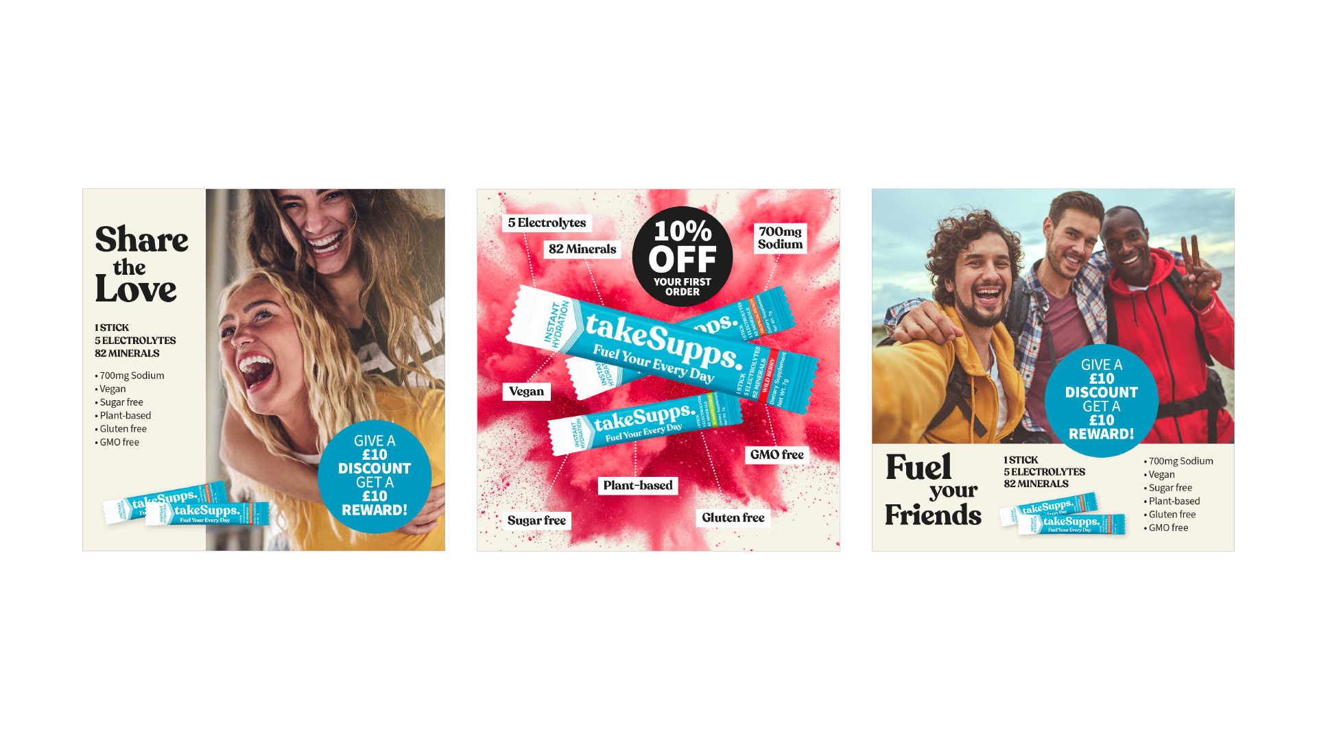
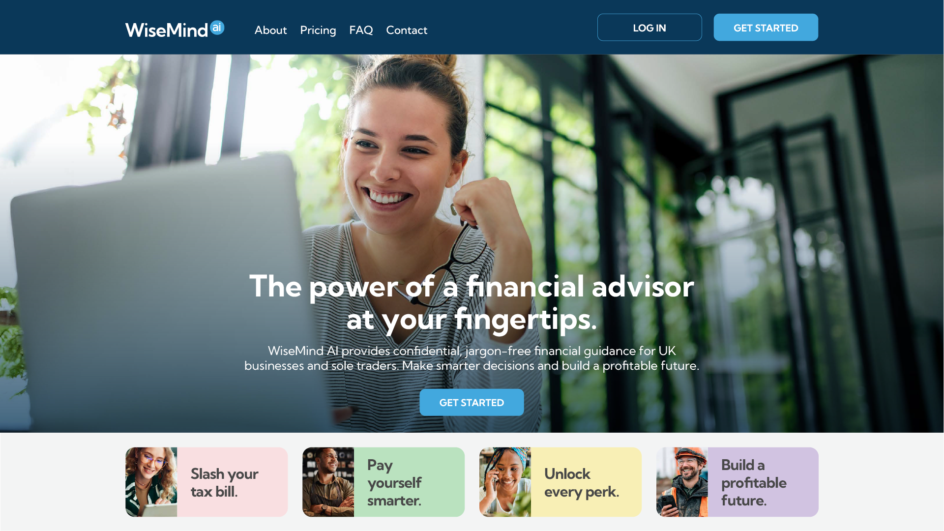
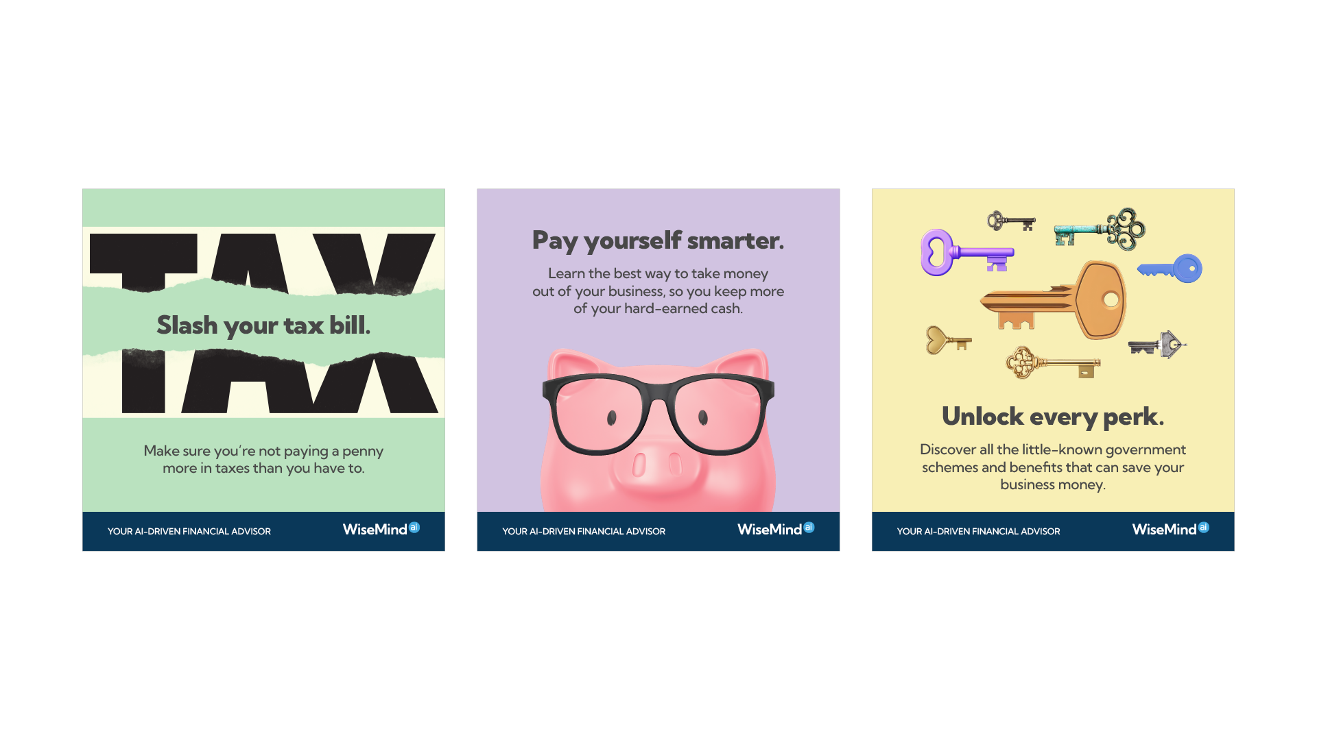
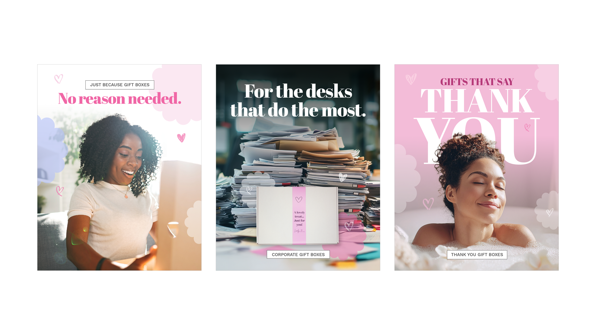
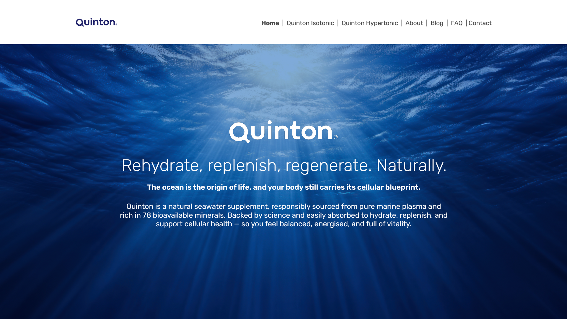
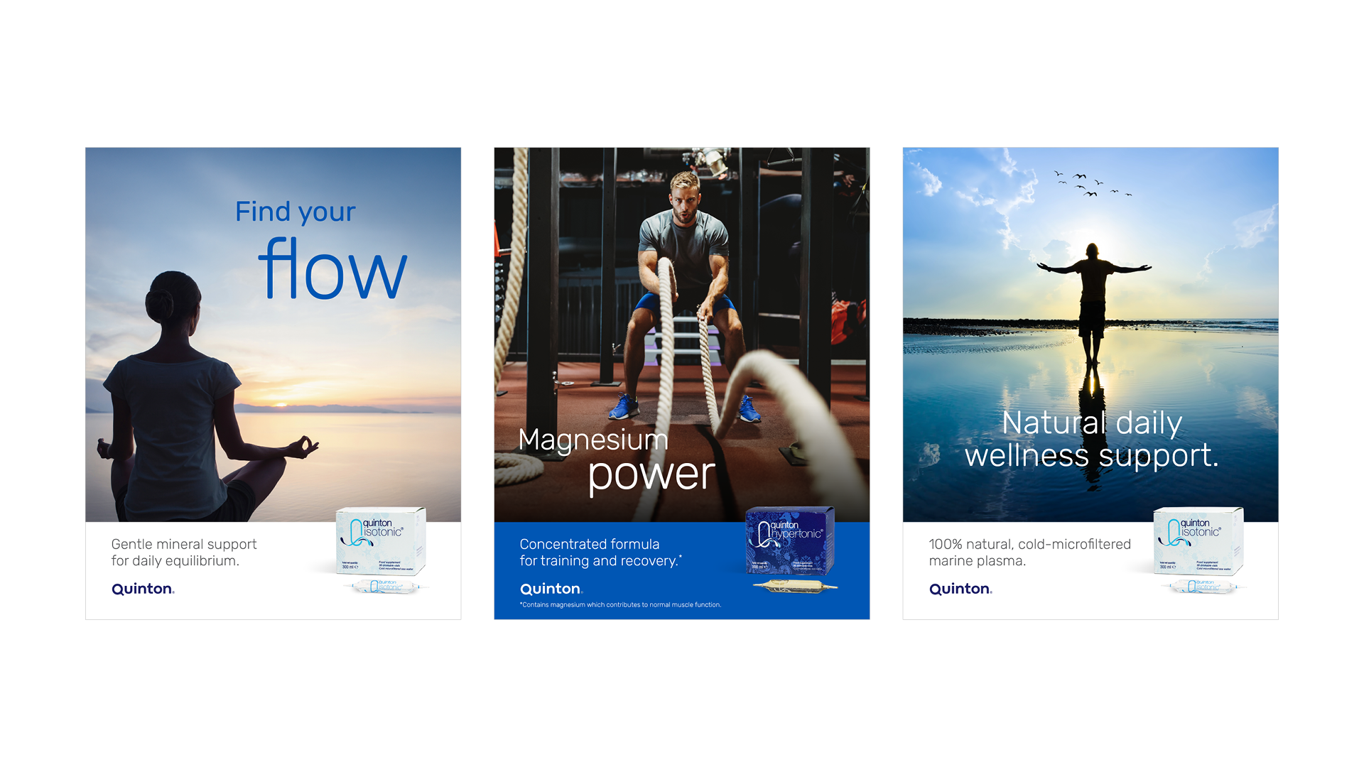
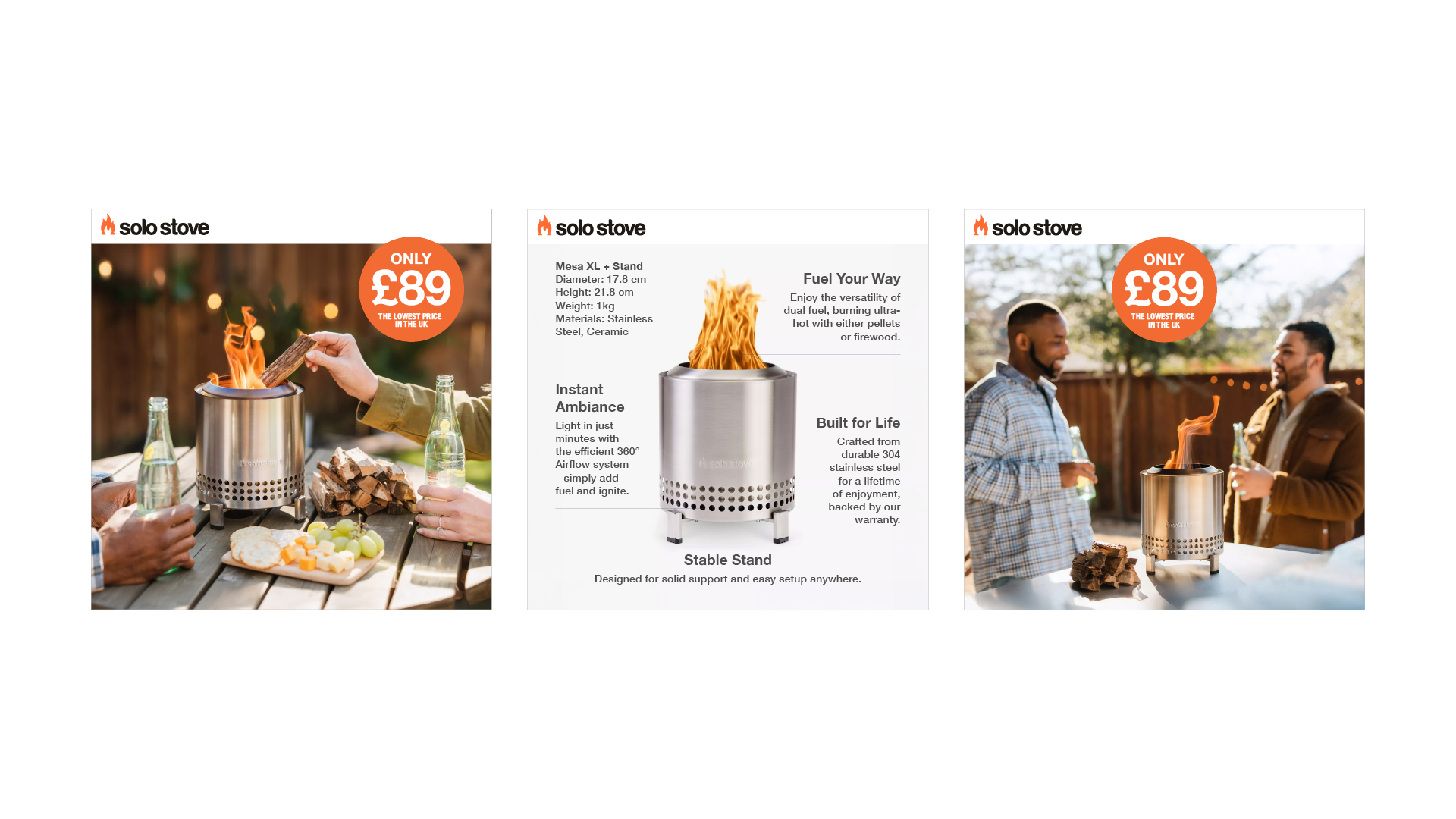
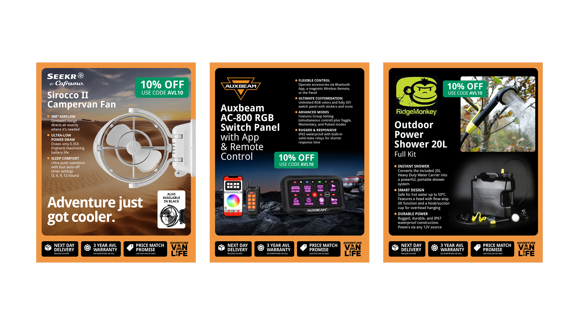
At Socialproof, I led the creative and visual strategy. Navigating the social landscape requires an understanding of platform-specific rules, balanced with the timeless fundamentals of design and advertising.
The Challenge
How to maintain high-end brand aesthetics within the fast-paced, disposable nature of social feeds.



Chadwell | Brand Identity
The Context
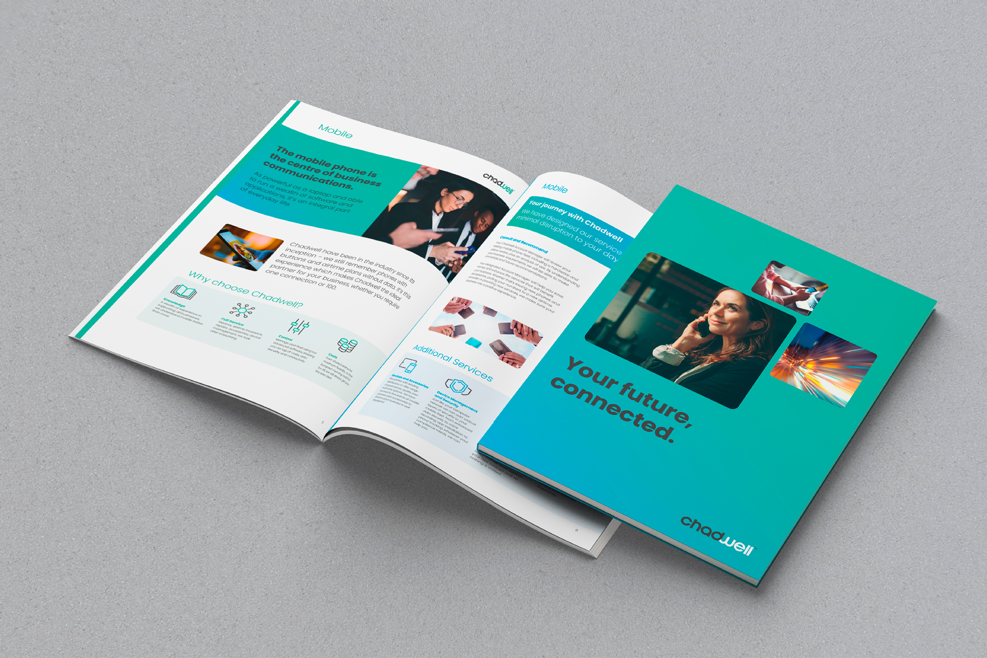
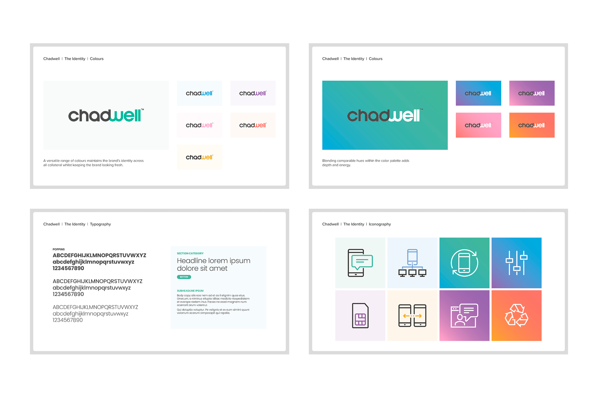
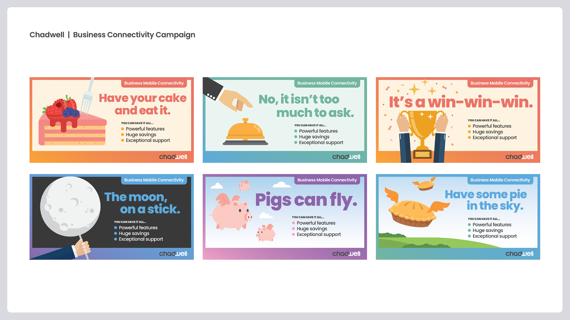
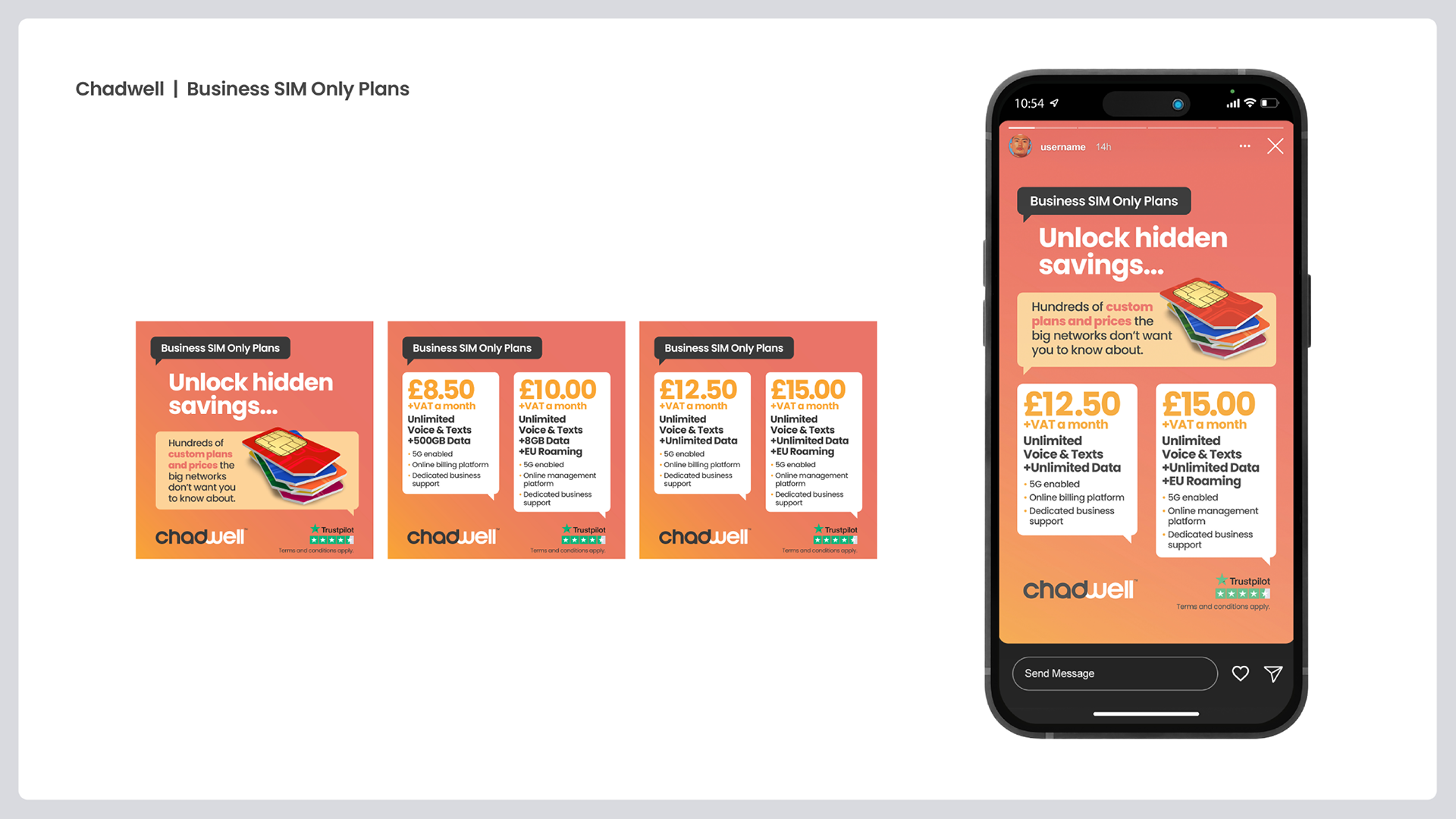
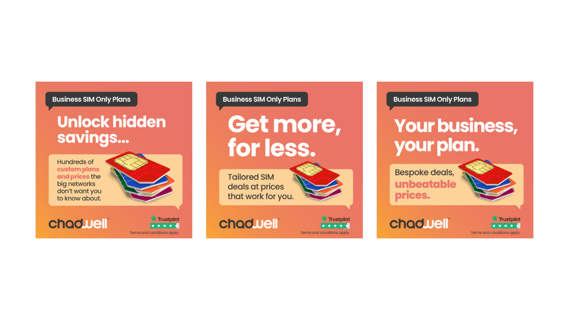
Chadwell is a relatively new entrant in the telecommunications sector. I was brought on to build the brand from the ground up, establishing the core identity, visual language, and overall look and feel for the company’s launch.
The Challenge
The telecoms industry is often perceived as cold and impersonal. Chadwell needed to establish immediate professional authority to compete with industry giants, while simultaneously highlighting their USP: a personal, family-run approach to business communication.
The Solution
A colourful brand identity and visual system that feels modern and big enough to handle enterprise needs, but also clean and accessible, to feel personal. The result is a cohesive look and feel that positions Chadwell as a trustworthy, expert partner from the very first interaction.
Cheshire Demolition | Brand Identity & Website
The Context
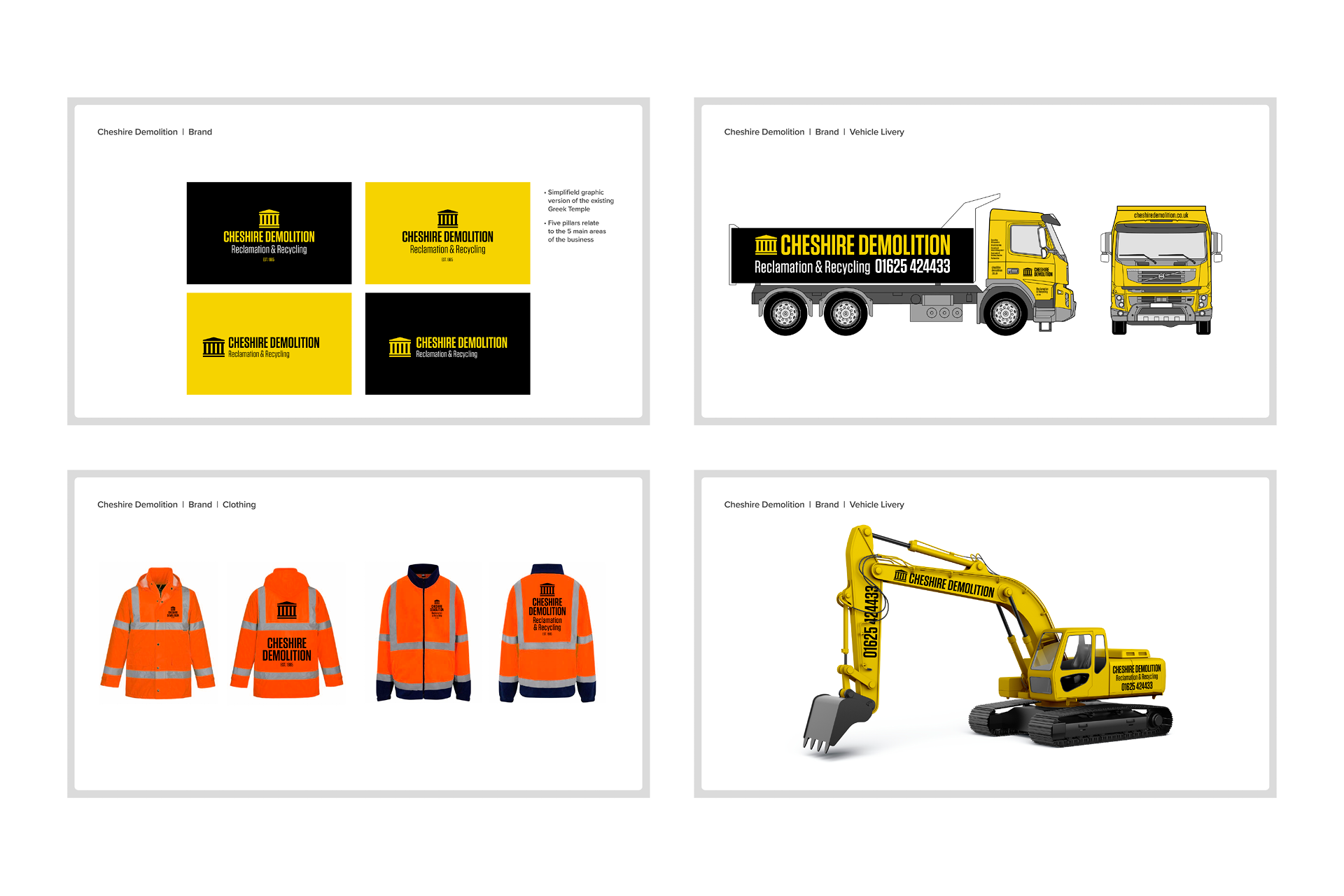
Cheshire Demolition is an established leader in their field. While they initially wanted a new website, it quickly became clear that the real challenge was their brand identity. Their messaging had become confused, and their visual presence didn’t reflect the full scope of their business.
The Challenge
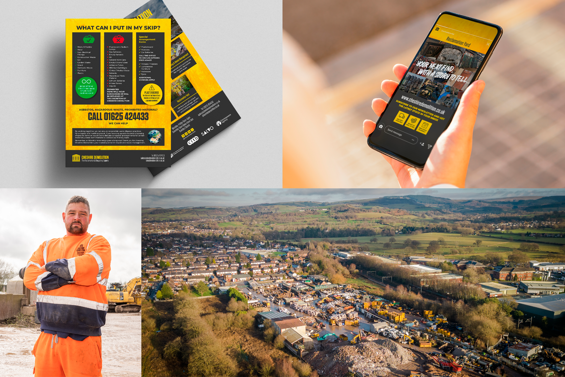
There was a significant perception gap. The public saw them solely as a demolition company, leaving their reclamation yard undervalued. We needed to separate their diverse services while uniting them under one clear mission. They are a vital part of the circular economy, but their branding only told half of that story.
The Solution
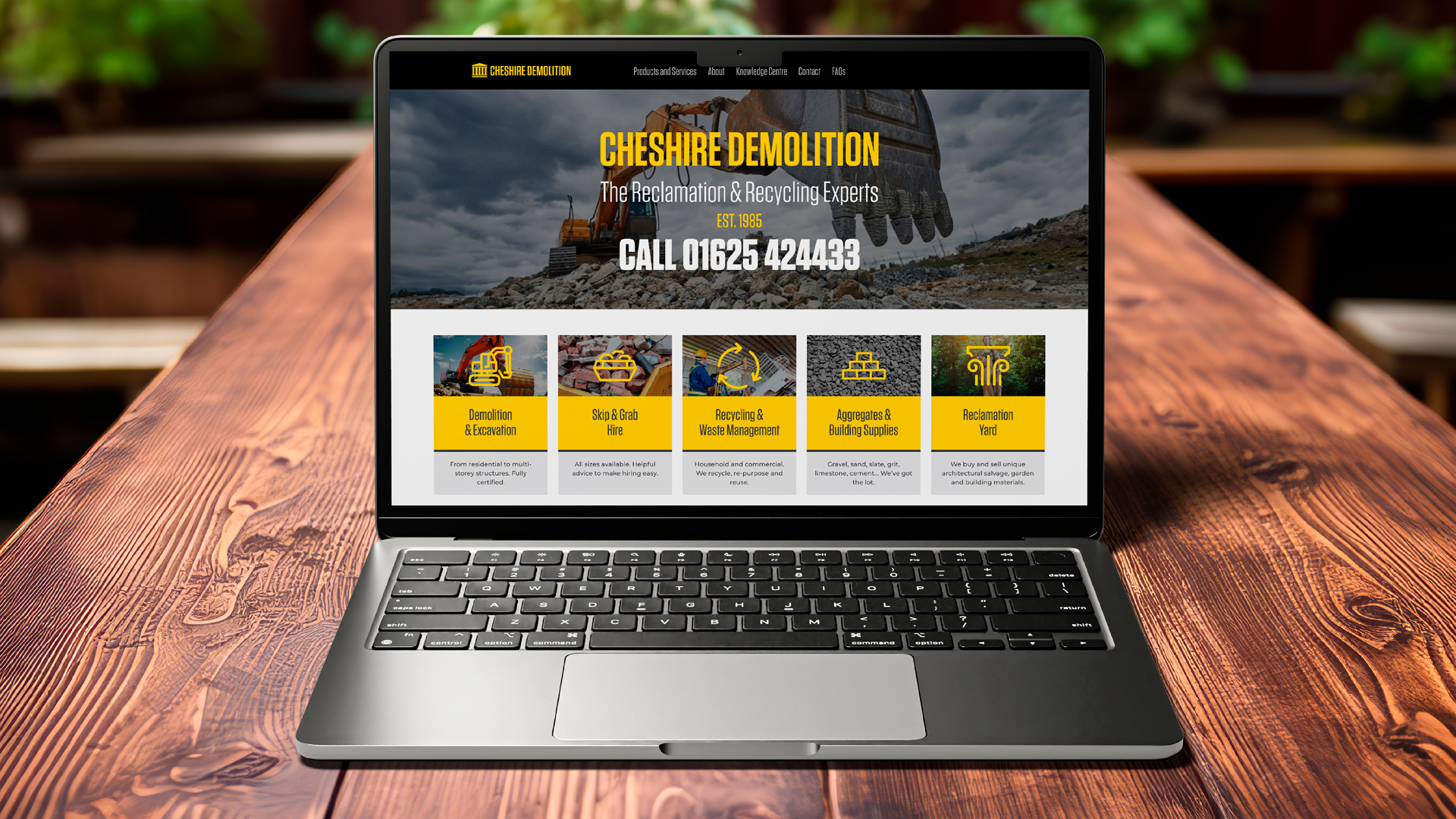
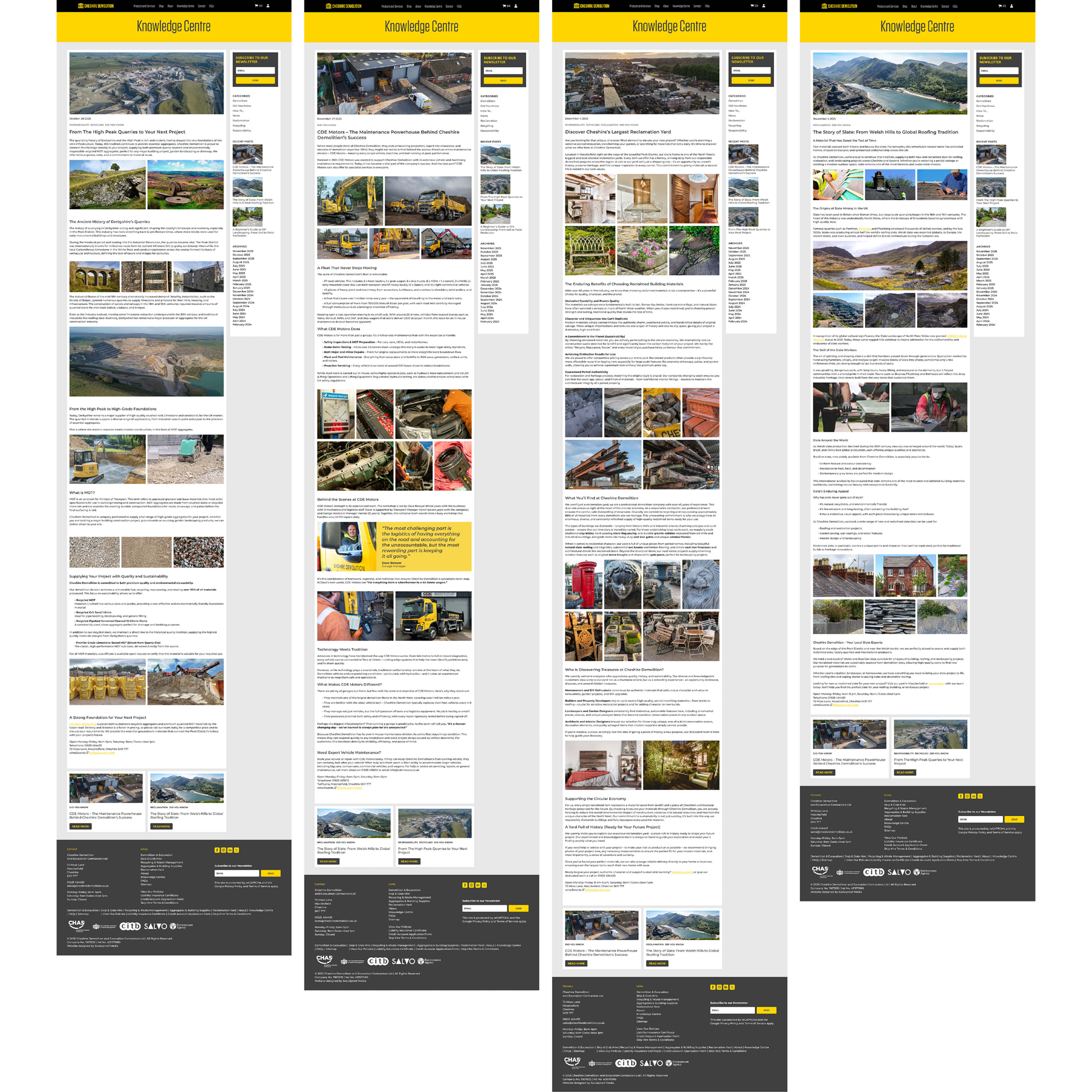
I created a digitally-ready brand identity that provides clarity and structure across all sectors of the business. Central to this was a new website and a "Knowledge Centre" blog. Rather than simply telling people they are experts, the blog shows it – educating the audience on reclamation and recycling. The result is a brand that repositioned them from a demolition firm to a sustainable leader in the circular economy.
Crawfords | Brand Identity & Architecture
The Context
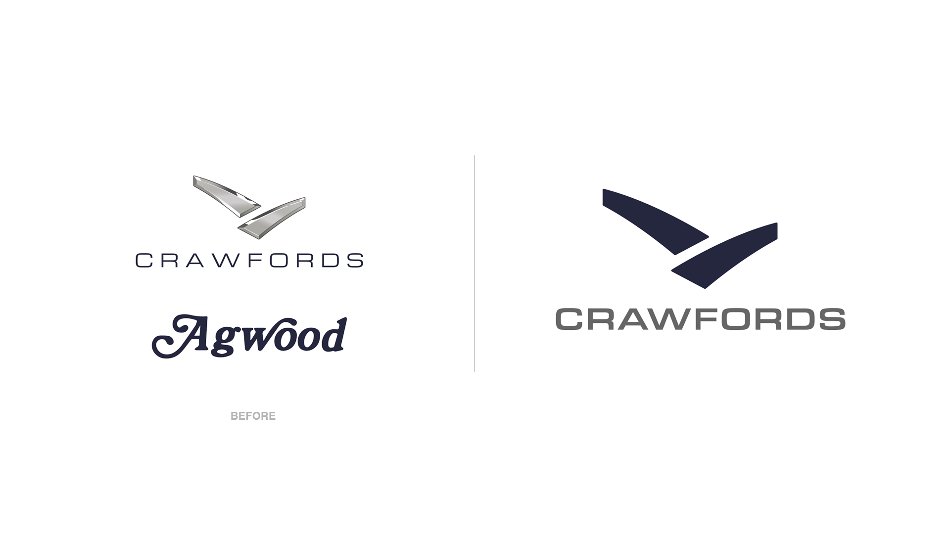
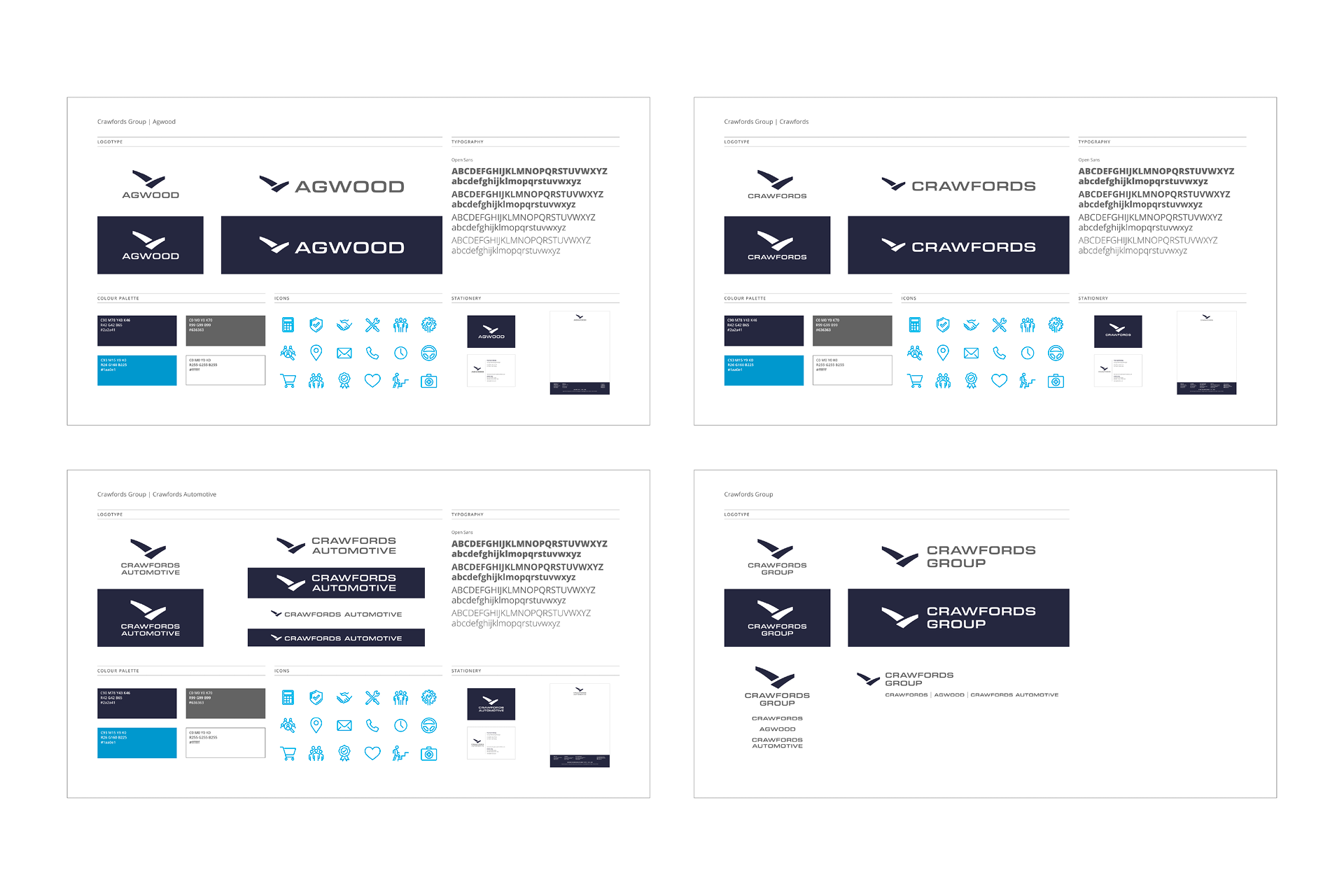
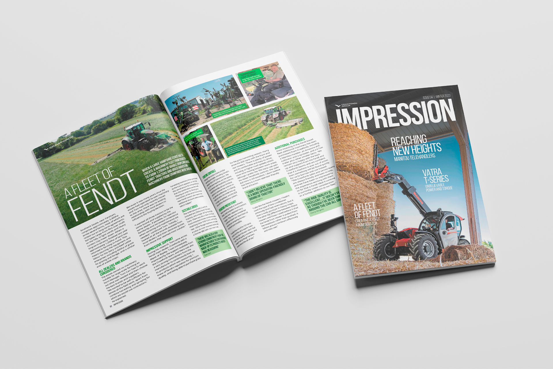
Crawfords is a multi-sector group operating across automotive and agricultural machinery. They needed a unified visual strategy to connect the parent Group with its subsidiaries.
The Challenge
Automotive branding has shifted toward flat design to ensure legibility on screens. The challenge was to modernise the Crawfords identity – moving away from complexity toward a streamlined system that works across everything from smartphones to signage.
The Solution
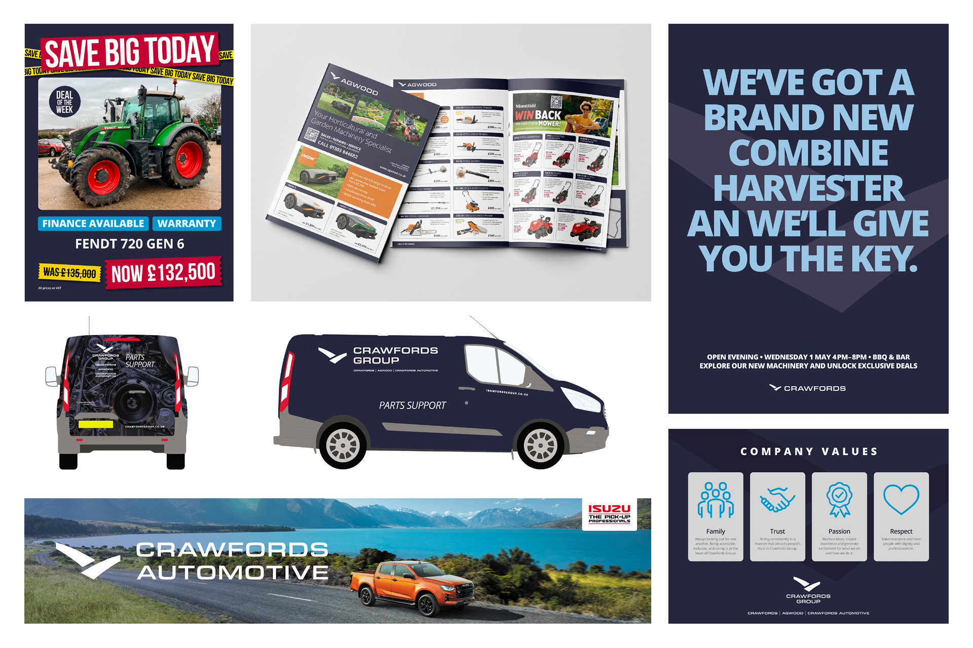
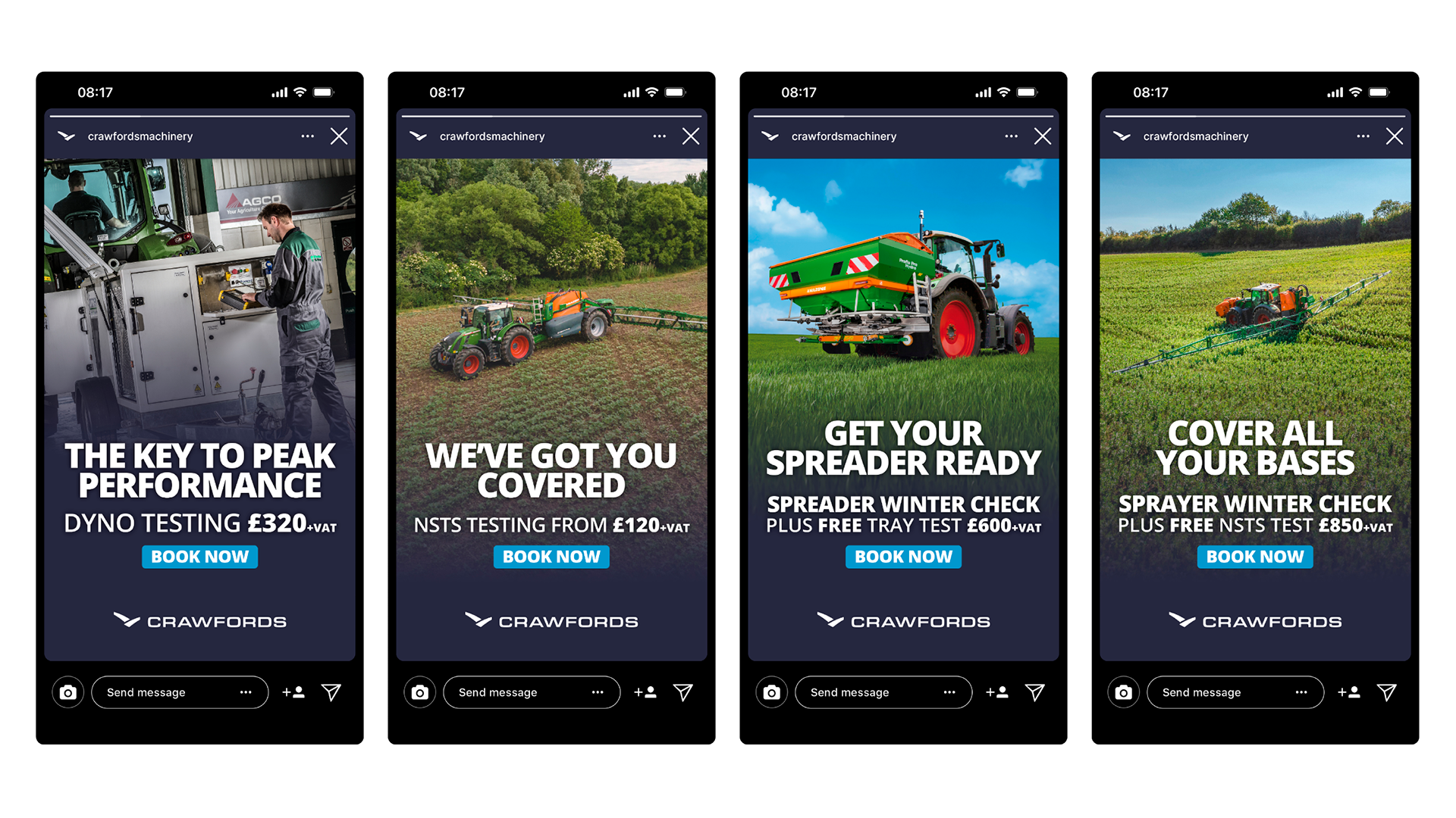
A digital-ready brand architecture that unifies the entire family of brands. By simplifying the visual language, we created a cohesive system that allows the sub-brands to flourish while strengthening the authority of the overall Group.
Further Projects
Beyond the featured case studies above, here is a broader collection of work from my archive. If you’d like to see more examples of a specific discipline or want to discuss a new project, please get in touch.